|
|
Post by KG on Jan 4, 2006 9:55:14 GMT -5
Hi, I just put this up today. I really would like to link our associated site, which by the way looks a lot better. I want to put a link in the header, or somewhere, but I can't figure out how to do that yet. The code here is't exactly straight HTML... I know some people on the other forum had some fancy stuff, and I was wondering how to link the new site... I am still having trouble with it a little. I think that will be fixed soon. I just installed it this morning. Anyway the URL for that is: www.angelfire.com/crazy/spiritsense/index.htmAnyway let me know what you think A few hours later... Well I got the site linked and tweaked the design a little. The other site is prettier, but this one is faster. If you want to submit pictures or articles, just let me know. We have a really pretty site, where these kinds of things can be displayed. I can change the background on just one page overthere, and Do all kinds of things that are hard to do on the proboards. Later we might link a third site, but for now two seems like enough, since there are only three of us, but I would like to get some theory down, and give everyone a chance for input. No one is going to bite your head off for expressing an opinion here, and there is no real right and wrong, only experience, and trying to interpret it. It is amazing what you can get for free on these sites! All the sites we have are free, and that way we all share the site. Later we might make a distinction between novices and adepts but right now we just have people. By the time we have to worry about that, of course everyone will be adept, and we will be thinking about new comers. I was trying to get private boards on here, but so far no luck... I am working on it, so that we can have some groups who can talk without anyone outside the group being able to see. I will keep trying. Well I think we've got a good start, but I need input. |
|
|
|
Post by Del on Jan 4, 2006 14:04:16 GMT -5
Well I can't stay on long to read everything but so far I really like it. The separate pages on the side is a great idea. We can post our iput o things. I like! Um, my mom's hogging the comp so throughout the day i'll provide more for you.
As far as the private thing goes, I know bravenet has that feature where you give a password for the forum and give the option for private viewing or public viewing...like that crazy guy that was kicked off of the other forum...that fanatic General guy...
|
|
|
|
Post by KG on Jan 4, 2006 15:33:23 GMT -5
I don't remember the general guy, but yes I think there are passwords to limit access to certain areas of the forum, and still make it an open forum for the most part. In other words private and public areas. Each Section can be locked for password only, and there is something to do with staff only areas that can be created, but we can figure that out later.
As it is, there are only the three of us. I messaged two others but they haven't opened their mail yet. I also plan to have a third site with a chat room later on... like the one we had before and never used... I must have hit the wrong button or something, anyway I can get it back, and make it match the other sites if we need that, but right now... I'm sleepy. I was up all night.
|
|
|
|
Post by Velen on Jan 5, 2006 18:34:47 GMT -5
Orange.. eating my eyeballs! It's cool, but it's bright, if you ask me. But it is nicely organised.
|
|
|
|
Post by Sonariss on Jan 5, 2006 18:56:33 GMT -5
Yeah, I really enjoy this design, it's simple, clean, and easy to navigate. The crazy cool sunface background fits it to a point, but however, it is a bit.... orange. Everything else is also orangey, so perhaps swapping colors around a bit would help? For instance, the text within the brown borders is rather hard to read, it's nearly the same color. It looks good in the yellow boxes but like, stuff such as the quick reply box should be slightly more visible, to just make it easier on the eyes. Perhaps a darker background pic or color would help, to balance out the bright boxes. Think of we nerds in our dark rooms, we can't handle so much light! It burns the retinas, it does.  Err, Ill probably start or already have started sounding a bit on the overly critical side, but I used to be the main admin for a Lucid Dreaming forum myself, for a few months till it died due to the guy who was paying for the server quitting his job where he was getting the server really really cheap. And I having no way to pay, had to let it slowly fade. It was too bad, but the forum itself wasn't going much of anywhere anyhow, due to there being several already excellent LDing forums out there and my slight laziness. As such, I felt it was my duty to inform you of that. Err, yeah. |
|
|
|
Post by KG on Jan 5, 2006 23:02:42 GMT -5
Yes it is yellow and orange and bright in a way, Funny I was going to use the darker one that is on the other site. Did you check out the sister site, that links to it?
I was up all night trying to figure out code, and I had to change my service provider, for the other site, cause I didn't read the fine print, that it wouldn't take a front page down load, then the second one said it would, but it wouldn't. There was a problem with their servers that night so I signed up with Angel Fire.
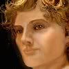
By the time I got around to designing this site the insanity took over, by about lunch time the next day. I like it, since I prefer insanity, but I wish I could read the type that lays over the faces... It is too small a print, and I couldn't get the code to change the type for some reason. I need to work with it some more... Maybe you could help me out a bit. I am not great with HTML and this isn't standard HTML. Click View Source and see if you can figure out what it is?
I designed and put up both sites, in three days with all origional art work. Most of it I did in a sleepless stretch of almost 48 hours. We will fine tune it later.
I wanted the background darker originally, but when I saw the Golden images, I just went crazy for the color. IT looks like King Tut's Mask, done in an aztec style, but it was an alchemical motif to start with. I thought wow three mystical traditions it makes me think of... and the color Gold does have a lot to do with Alchemy... anyway this was the result of a sleepless trip... but it does keep you awake. Any help would be appreciated in things like making the type more ledgable. I pulled everything I could up a point size, but for some reaons I couldn't get some of the type to respond. Maybe they lock it.
|
|
|
|
Post by stonerwolf on Jan 5, 2006 23:55:57 GMT -5
is it just me or does it look like the painted lady has a mustache, or that the painted man looks like a lady? i like it though, this is a complement before it is a complaint  |
|
|
|
Post by Sonariss on Jan 6, 2006 1:29:50 GMT -5
Argh!! It's CGI. I know nothing of CGI! Well, almost nothing. I know what it is but have no freaking clue how to edit the stuff. I can assume it's not too complex though, after all. It IS a free forum though, so you can't complain that they use CGI script intstead of PHP. I think i've seen the administrative panel for these somewhere before but they're not too great looking, and overall definitely not as customizable as, say, PHPBB Forums or Invision Powerboard, both of which I can understand a whole lot better. Still and all, shouldn't be hard to figure out given the context, and overall you've done a nice job on everything  EDIT: Point size does depend on what size of text you have on your browsers' setting after all. If you really can't change it through the forum settings somehow, try doing a font face change instead, such as, use Arial instead of Times New Roman. Both are easy to read and common fonts, but Arial tends to be just a bit larger than Times New Roman. |
|
|
|
Post by KG on Jan 6, 2006 2:01:00 GMT -5
I went in and changed some code, but it didnt' seem to matter on the main forum. I figure it is protected some way where people can't screw up their forums, where they won't work.
I wrote code for the banners, and through trial and error I finally got them where I wanted them. For some reason at one point I got a big red square behind everything, but I got rid of it. I copy/pasted code from the sorce code, on one of the other forums that looked cool, and also had a custom banner, then I changed it to possition the banner. I don't write code, so that was interesting. I understand the principles of HTML, but I can never remember exactly what to write, and have to go back and read on line tututorials. Since it isn't HTML the tutorial didn't help.
If I could get the big red box to come back, I could change the color, and let it run like a second layer behind all the textboxes on the forum. Then people could read the type. But I can't remember what the code said that caused the box.
The permissions, and standard changes aren't very helpful. I can change the text color, but not the weight. If I change the face it changes throughout, and it doesn't give choices, so I don't know what fonts they have available. I wish I had a bold font, instead of the spidery little type.
|
|
|
|
Post by KG on Jan 6, 2006 2:16:23 GMT -5
Stoner, LOL that is one of my paintings and I used Johnny Depp as a model. My daughter will get a kick out of the fact you think he looks like a girl. She always says that about Depp.
The picture is my impression of what he would look like in the astral, in a drug induced vision. It is an illustration in the book I wrote last year, and in the story, the male character appears to the female, after she has a vision quest to find him. She takes Bellidonna and Opium along with other herbs, in serious overdose, counting on the fact that one is an antidote for the other. It could have killed her, and she does almost die, but she has a vision of him, and he comes and makes love to her while she is convulsing on the floor. The glowy golden tone and reflection of his skin, has to do with her mental symbolism of him in the book. I used the picture, because he is my symbol for the Golden Man. His skin tone in the painting matches the rest of the site too. I was trying to create an extra demensional look, and the effect that he is some how golden and sparkling.
|
|
|
|
Post by stonerwolf on Jan 7, 2006 2:40:18 GMT -5
it's a cool painting! and sounds like a cool book as well! |
|
|
|
Post by stonerwolf on Jan 8, 2006 2:49:11 GMT -5
|
|
|
|
Post by KG on Jan 9, 2006 0:55:00 GMT -5
Thanks! I was actually needing something for the other site, the one with the information, and this might work very well. I like the At the top from the top one. I love the foggy look of the clouds. I appreciate the offer, and I do need background images for some things, and more as we go along. I might try to give you guys a choice of skins, once I feel brave enough to try configuring another one. Of course I have some help now, so maybe we can get through that together. Anyway when we do make skin options, I'll be sure to include a couple of these. Also I want to know who wants to moderate what. At this point everyone on this board is a potential moderator. That includes everybody. LOL If you want a topic let me know. If we don't have that topic yet we can make it! Now I am giving permissions to change things on the board... but you know... responsibably. I mean if some troll comes a long and links us to a porographic nipple piercing site or something, and I am not at home, or on line... I hope someone will delete that for me, but don't delete the good stuff before I get to read it. Save me a copy or something! ;D LOL We will have no iron hand moderation, just simple common sense, and short of pornography, illeagal stuff, or something totally hideous beyond my comprehension we won't be deleating things. This is a free speach forum, and if someone should want to call me a pregnant dog...LOL that is one of the substitue words on the automatic dirty word sensorship thingy... Well just leave that up. It sounds kind of cute, and I don't really care. Just remember I am a very big pregnant dog.... and there is nothing meaner than a pregnant dog Grrrrrr... just kidding. I don't bite...  Anyway I am very happy with the progress we have made, and I will soon be handing out forum jobs to whoever wants them, and assigning permissions to whomever wants them. |
|
|
|
Post by stonerwolf on Jan 9, 2006 1:57:47 GMT -5
if i can be put in charge of skins... i can use that real well, but if not, the general idea is
RRGGBB
0-9 and A-F F = most vibrant color.
so 00FF00 would be bright green, and 99FF99 would be bright light green.
770077 would be purple, and so on...
it's kind of annoying at first, mixing and matching colors, and remembering what colors go where... if you're not careful you'll have text you cant read lol
|
|